Bubble Works
“We started Grid City Beer Works to create something different—thoughtfully brewed, creatively designed, and always true to who we are. When it came time to launch Bubble Works, we knew it had to feel fresh, bold, and full of personality. James and the team at Design Axl completely nailed it. They understood the vision from day one and brought the brand to life in a way that’s playful, polished, and totally us. The response has been amazing—and winning awards are the cherry on top.”
— Drew Reynolds, Co-Founder, Bubble Works
![]()
![]()
“We started Grid City Beer Works to create something different—thoughtfully brewed, creatively designed, and always true to who we are. When it came time to launch Bubble Works, we knew it had to feel fresh, bold, and full of personality. James and the team at Design Axl completely nailed it. They understood the vision from day one and brought the brand to life in a way that’s playful, polished, and totally us. The response has been amazing—and winning awards are the cherry on top.”
— Drew Reynolds, Co-Founder, Bubble Works

Bubble Works is the kind of project we love—bold, flavorful, and full of personality. As an offshoot of Grid City Beer Works, Bubble Works needed to stand on its own while still feeling like part of the family. So we kept a few familiar visual cues from Grid City’s core lineup, then cranked up the volume to match the energy of this playful new brand.
From the start, one of our main goals was simple: create a can you could spot from across the room. Mission accomplished. Bright, unexpected color combinations give each flavor its own vibrant personality, while the clean, modern logo and circular "bubble-grape" icon create instant recognition. The layout is confident and minimal, letting the color do the talking while delivering just enough structure to keep things grounded.
We designed the system to be flexible but cohesive—a shelf that looks like a celebration, whether you’re seeing one can or a full line. The tone is fun, fresh, and a little cheeky—like that cousin who brings good energy to every party and leaves with all the best stories.
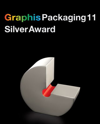
The result is a visual identity that not only stands out in the craft seltzer space but also reflects the thoughtful, flavor-forward creativity behind every batch. The work has been recognized with multiple industry honors, including a 2025 GDUSA Package Design Award, placing in the top 10% of more than 2,600 entries, and a Silver Award in the Graphis Packaging 11 Awards, selected by an international jury. Graphis is one of the most respected design catalogs in the world, recognizing bold thinking, craft, and impact in global design.
From the start, one of our main goals was simple: create a can you could spot from across the room. Mission accomplished. Bright, unexpected color combinations give each flavor its own vibrant personality, while the clean, modern logo and circular "bubble-grape" icon create instant recognition. The layout is confident and minimal, letting the color do the talking while delivering just enough structure to keep things grounded.
We designed the system to be flexible but cohesive—a shelf that looks like a celebration, whether you’re seeing one can or a full line. The tone is fun, fresh, and a little cheeky—like that cousin who brings good energy to every party and leaves with all the best stories.
The result is a visual identity that not only stands out in the craft seltzer space but also reflects the thoughtful, flavor-forward creativity behind every batch. The work has been recognized with multiple industry honors, including a 2025 GDUSA Package Design Award, placing in the top 10% of more than 2,600 entries, and a Silver Award in the Graphis Packaging 11 Awards, selected by an international jury. Graphis is one of the most respected design catalogs in the world, recognizing bold thinking, craft, and impact in global design.


We’ve been collaborating with Grid City Beer Works for years, and Bubble Works is another example of the trust and creative freedom that make these projects so special. If you’re ever in Salt Lake City, stop by the taproom and experience it for yourself—can in hand. Want to see more? Take a look at the full body of work we’ve created with Grid City.